

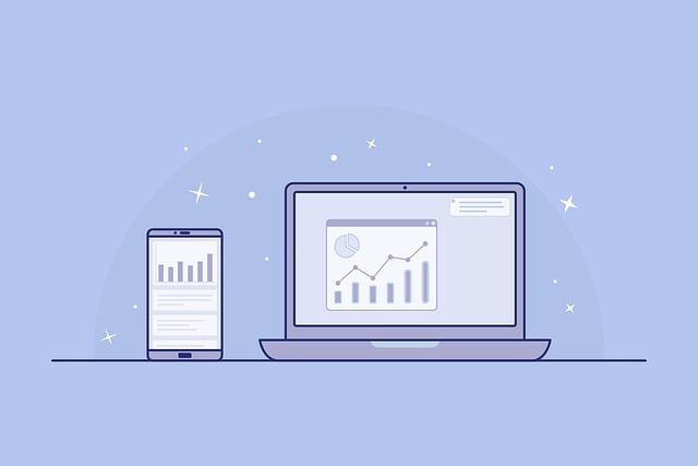
In today’s digital landscape, you have exactly three seconds to make an impression. That’s how long the average visitor takes to decide whether your website is worth their time. What makes a well designed website? It’s not just about looking pretty—it’s about creating an experience that captivates, informs, and converts visitors into loyal customers.
Whether you’re a business owner investing in your first website, a marketer optimizing for conversions, or a designer seeking to refine your craft, understanding what makes a well designed website is essential to your success. A poorly designed website costs you money every single day through lost leads, abandoned carts, and damaged credibility. Conversely, a well-crafted digital presence becomes your hardest-working salesperson, operating 24/7 to grow your business.
The difference between a website that thrives and one that barely survives comes down to mastering 12 fundamental elements. From visual hierarchy and lightning-fast load times to mobile responsiveness and accessibility, each component plays a critical role in your overall success. Many businesses make the mistake of focusing on just one aspect—perhaps investing heavily in beautiful graphics while neglecting page speed, or creating stunning desktop designs that crumble on mobile devices.
In this comprehensive guide, we’ll explore exactly what makes a well designed website by breaking down each essential element. You’ll discover actionable strategies used by top-performing websites, backed by research and real-world results. Whether you’re exploring free website design for business options or working with a professional website design company, these principles will help you make informed decisions that drive measurable results. Let’s dive into the 12 elements that separate exceptional websites from mediocre ones.
The Foundation of Visual Design
Visual design is the first thing visitors notice when they land on your website, and first impressions are formed in just 50 milliseconds. What makes a well designed website stand out visually? It starts with a cohesive color scheme that aligns with your brand identity while considering color psychology. Blue evokes trust and professionalism—which is why you’ll see it dominating financial and healthcare websites. Red creates urgency and excitement, making it perfect for clearance sales and call-to-action buttons. Green suggests growth and environmental consciousness, ideal for sustainable brands and wellness companies.
Typography hierarchy is equally crucial to visual design success. Your website should employ a clear typographic system with distinct levels: primary headlines (H1) that grab attention, secondary headers (H2-H3) that organize content, and body text that’s effortlessly readable. Stick to two or three complementary fonts maximum—using too many creates visual chaos and undermines professionalism. Font size matters tremendously: body text should never fall below 16px, and line height should be approximately 1.5 times the font size for optimal readability.
White space, often called negative space, is where many amateur designers fail. Cramming every pixel with content creates cognitive overload and drives visitors away. Strategic white space guides the eye, creates breathing room, and actually increases comprehension by up to 20%. Look at Apple’s website—their generous use of white space makes their products the hero and creates an impression of sophistication and quality. What makes a well designed website effective isn’t what you add, but often what you have the discipline to leave out.
Visual balance ensures your website feels stable and organized rather than lopsided or chaotic. This can be achieved through symmetrical balance (mirroring elements on both sides) or asymmetrical balance (using different elements that carry equal visual weight). Contrast—in colors, sizes, and shapes—creates focal points that direct attention to your most important elements. High contrast between text and background ensures readability, while contrasting button colors make calls-to-action impossible to miss.
User Experience (UX) Architecture That Converts
User experience architecture is the invisible framework that determines whether visitors accomplish their goals on your website—or leave in frustration. Understanding user intent is the foundation of exceptional UX. Why did someone land on your page? Are they researching options, ready to purchase, or looking for customer support? What makes a well designed website different from competitors is its ability to anticipate these needs and provide clear pathways to solutions.
Journey mapping helps you visualize the steps users take from landing page to conversion. A visitor researching accounting software might follow this path: Homepage → Features Page → Pricing → Case Studies → Sign Up. Each page in this journey should logically lead to the next while providing exit ramps for those who need different information. Identifying friction points—confusing navigation, unclear value propositions, or complicated forms—is essential. Research shows that reducing friction in the user journey can increase conversions by up to 400%.
Intuitive interface design means users can accomplish tasks without thinking. When someone lands on your contact page, the form should be immediately visible—not buried below three paragraphs of text. Buttons should look clickable with appropriate size (minimum 44×44 pixels for touch targets) and clear labeling. Never use “Click Here” or “Submit”—instead, use action-oriented text like “Get Your Free Quote” or “Download the Guide.” What makes a well designed website intuitive is consistency: similar elements should look and behave the same throughout your site.
Information architecture determines how content is organized and labeled. A well-structured website uses a logical hierarchy—typically no more than three clicks deep from homepage to any piece of content. Categories should be mutually exclusive and comprehensive, following the principle that users should never wonder “where do I find X?” Research by Nielsen Norman Group shows that users often leave websites because they can’t find what they’re looking for, even when that content exists. Clear labeling using familiar terminology (not internal jargon) and a shallow, broad structure typically outperforms deep, narrow architectures. Testing your information architecture with real users reveals blind spots you’d never discover on your own.
What Makes A Well Designed Website Load Fast
Page speed isn’t just a technical consideration—it’s a make-or-break factor for user experience and search engine rankings. Google research reveals that 53% of mobile users abandon sites that take longer than three seconds to load. Every additional second of load time can decrease conversions by up to 7%. What makes a well designed website load fast comes down to optimizing every element that travels from server to screen.
Core Web Vitals are Google’s official page speed metrics that directly impact your search rankings. Largest Contentful Paint (LCP) measures loading performance and should occur within 2.5 seconds. First Input Delay (FID) measures interactivity and should be less than 100 milliseconds. Cumulative Layout Shift (CLS) measures visual stability—nothing is more frustrating than clicking a button only to have the page shift and click something else. Aim for a CLS score under 0.1. Tools like Google PageSpeed Insights and GTmetrix provide detailed reports on these metrics with specific improvement recommendations.
Image optimization is the single most impactful speed improvement for most websites, as images typically account for 50-70% of total page weight. Compress images without sacrificing noticeable quality using tools like TinyPNG or ImageOptim. Implement next-gen formats like WebP, which provides 25-35% better compression than JPEG. Use responsive images with the srcset attribute to serve appropriately sized images based on device screen size—why send a 3000px image to a mobile phone with a 400px wide screen? Lazy loading delays loading images until they’re about to enter the viewport, dramatically improving initial page load times.
Code optimization involves minifying CSS, JavaScript, and HTML to remove unnecessary characters, comments, and whitespace. Enable GZIP or Brotli compression on your server to reduce file sizes by up to 70%. Implement browser caching so returning visitors don’t need to download resources they already have. A Content Delivery Network (CDN) like Cloudflare or Amazon CloudFront serves your content from servers geographically closest to each visitor, reducing latency. Combine these strategies, and you can often reduce page load times from 8-10 seconds to under 2 seconds—a transformation that directly impacts your bottom line through improved engagement and conversions.
Mobile Responsiveness in a Mobile-First World

Mobile devices now account for approximately 60% of all web traffic, and that percentage continues to climb year over year. Google uses mobile-first indexing, meaning it predominantly uses the mobile version of your content for ranking. If your website isn’t optimized for mobile, you’re not just losing half your potential audience—you’re also sabotaging your search engine visibility. What makes a well designed website successful in 2025 is mobile responsiveness as a foundation, not an afterthought.
Responsive design uses flexible grids, flexible images, and CSS media queries to automatically adapt your layout to any screen size. A three-column desktop layout might stack into a single column on mobile. Navigation menus collapse into hamburger icons. Font sizes scale appropriately, and touch targets enlarge to accommodate fingers rather than mouse cursors. The alternative—maintaining separate desktop and mobile sites—is costly, inefficient, and prone to content inconsistencies. Modern frameworks like Bootstrap and Foundation make responsive design relatively straightforward, but the principles matter more than the tools.
Touch-friendly interfaces require rethinking interaction patterns designed for mouse and keyboard. Buttons and links need sufficient size (minimum 44×44 pixels) with adequate spacing to prevent accidental taps. Hover states don’t exist on touchscreens, so critical information revealed on desktop hover must be accessible through other means on mobile. Form inputs should trigger appropriate mobile keyboards—email inputs should show the @ symbol, phone number inputs should display a numeric keypad, and date inputs should open a calendar picker. What makes a well designed website mobile-friendly is this attention to the unique constraints and capabilities of touchscreen devices.
Testing across devices is non-negotiable because responsive design frameworks can’t account for every device quirk and browser variation. Your website might look perfect on iPhone but broken on certain Android devices. Use browser developer tools for initial testing, but supplement with real device testing using services like BrowserStack or physical device labs. Pay special attention to landscape vs. portrait orientations, different screen sizes (from compact smartphones to tablets), and various operating system versions. Monitor your analytics to identify which devices your actual visitors use, then prioritize testing on those specific configurations. A website that works flawlessly on the devices your audience actually uses will always outperform one optimized for theoretical averages.
Navigation and Information Structure
Navigation is the roadmap that guides visitors through your website, and poor navigation is one of the top reasons users abandon sites. Research shows users decide within 10-20 seconds whether a website contains what they’re looking for, and navigation plays a critical role in that snap judgment. What makes a well designed website easy to navigate? Clear, consistent, and intuitive menu structures that help users find information without thinking.
Primary navigation should be immediately visible—typically in the header—and limited to 5-7 main categories. Beyond seven items, users experience choice paralysis and decision fatigue. Each category should use clear, concrete labels rather than clever or vague terms. “Services” is better than “What We Do,” and “Contact” beats “Let’s Connect.” Mega menus work well for sites with extensive content, displaying subcategories in organized columns when users hover over main categories. For simpler sites, traditional dropdown menus suffice, but ensure they’re accessible on both desktop and mobile devices.
Breadcrumb navigation shows users their current location within your site’s hierarchy (Home > Services > Web Design > Portfolio) and provides quick links back to parent pages. This is especially valuable for e-commerce sites with deep category structures and content-heavy sites where users might enter through search engines. Internal linking within content helps users discover related information while distributing SEO value throughout your site. Strategic internal links can increase time on site by 50% or more by encouraging further exploration.
Search functionality becomes essential once your website exceeds about 20 pages. A visible search box with autocomplete suggestions helps users quickly find specific content without navigating through multiple menus. Implement filters and faceted search for e-commerce sites, allowing users to narrow results by price, color, size, brand, or other relevant attributes. Footer navigation often goes overlooked, but it’s prime real estate for important links users typically seek: contact information, privacy policy, sitemap, social media profiles, and key landing pages. A well-organized footer can actually improve conversions by providing one last opportunity to guide visitors toward valuable content before they leave your site.
Strategic Content That Engages and Informs
Content is the reason people visit your website, yet many businesses treat it as an afterthought, focusing exclusively on design aesthetics. What makes a well designed website truly effective is the strategic integration of compelling content that educates, persuades, and motivates action. Eye-tracking studies reveal that users scan web pages in an F-pattern—reading the first few lines fully, then scanning down the left side while occasionally glancing right for interesting information. Structure your content accordingly, front-loading important information and using the left alignment for key points.
Scannable formatting is essential because 79% of users scan rather than read word-for-word. Break up large text blocks with descriptive subheadings every 200-300 words. Use bullet points and numbered lists to present information in digestible chunks. Bold key phrases (not entire sentences) to help scanners identify important concepts. Keep paragraphs short—3-4 sentences maximum for web content—and use varied paragraph lengths to create visual rhythm. White space between paragraphs gives readers’ eyes a rest and makes content less intimidating than walls of text.
Headlines determine whether users engage with your content or scroll past it. Effective headlines incorporate numbers (7 Ways to…), specificity (How to Reduce Cart Abandonment by 23%), urgency (This Week Only…), or clear benefit statements (Save 10 Hours Per Week With…). Test different headline formulas to see what resonates with your audience. The first sentence of each section should deliver immediate value or intrigue, pulling readers into the full content. If users aren’t hooked within the first sentence, they’ll skip to the next section.
Visual content integration—images, videos, infographics, and charts—makes complex information easier to understand while breaking up text monotony. Relevant images increase engagement, but generic stock photos add no value and may actually decrease credibility. Original screenshots, custom graphics, and authentic photos of your team and products build trust. Video content, when relevant, can increase conversion rates by up to 80% and dramatically increase time on page. Infographics synthesize complex data into shareable visual formats, earning backlinks and social shares. Call-to-action placement matters tremendously—CTAs should appear after you’ve delivered value, not before, and should be visually distinctive without being obnoxious. Testing different CTA placements, colors, and copy can yield dramatic improvements in conversion rates.
What Makes A Well Designed Website Accessible to All
Web accessibility ensures that people with disabilities—approximately 15% of the global population—can perceive, understand, navigate, and interact with your website. Beyond the moral imperative, accessibility is legally required in many jurisdictions under laws like the Americans with Disabilities Act (ADA) and is increasingly a factor in search engine rankings. What makes a well designed website accessible? Adherence to Web Content Accessibility Guidelines (WCAG) 2.1 Level AA standards, which cover a comprehensive range of accessibility considerations.
Semantic HTML provides structure and meaning that assistive technologies like screen readers can interpret. Using proper heading hierarchy (H1, H2, H3 in logical order) helps users navigate with keyboard shortcuts and understand content organization. HTML5 semantic elements like <nav>, <main>, <article>, and <aside> clearly define page regions. Form labels must be explicitly associated with their inputs, and error messages should clearly indicate what went wrong and how to fix it. ARIA (Accessible Rich Internet Applications) attributes enhance semantics for complex interactive elements that HTML alone can’t fully describe.
Alt text for images provides descriptions that screen readers can vocalize to blind users while also improving SEO. Effective alt text describes the content and function of images concisely—”red submit button” rather than just “button,” or “graph showing 30% revenue increase in Q4” rather than just “graph.” Decorative images that provide no informational value should have empty alt attributes (alt=””) so screen readers skip them. Color contrast ratios between text and background must meet minimum standards: 4.5:1 for normal text and 3:1 for large text. Tools like WebAIM’s Contrast Checker help verify compliance.
Keyboard navigation support is essential for users who can’t use a mouse due to motor disabilities or those who simply prefer keyboard efficiency. Every interactive element—links, buttons, form fields, modals—must be accessible via keyboard alone, typically using Tab, Enter, and Arrow keys. The current focus state must be visually obvious through outline or background color changes. Skip navigation links allow keyboard users to jump past repetitive elements like navigation menus. For guidance on implementing these principles, reviewing the 5 golden rules of web design provides additional context on fundamental design principles that support accessibility. Testing with actual screen readers like NVDA (free) or JAWS and keyboard-only navigation reveals accessibility barriers you’d never discover otherwise.
Conversion Optimization Elements
A beautiful website that doesn’t convert visitors into customers, subscribers, or leads is merely an expensive digital brochure. Conversion optimization transforms passive browsers into active participants who take desired actions. What makes a well designed website convert effectively? Strategic placement and design of conversion elements based on psychology, user behavior research, and relentless testing rather than assumptions or personal preferences.
Call-to-action (CTA) design significantly impacts conversion rates, yet many websites use generic, uninspiring buttons. Effective CTAs use action-oriented, first-person language that emphasizes benefits: “Get My Free Analysis” outperforms “Submit” by up to 90%. Color psychology matters—contrasting colors that stand out from your color scheme draw attention without clashing. Button size and shape signal clickability: rounded corners feel friendlier, while sharp corners convey professionalism. White space around CTAs prevents visual competition and focuses attention. Strategic placement positions primary CTAs above the fold, but also at natural decision points throughout your content—after you’ve delivered value and built credibility.
Form optimization can dramatically increase completions by reducing friction and anxiety. Every additional form field decreases conversion rates by approximately 11%, so ruthlessly eliminate unnecessary fields. Ask only for information you absolutely need at this stage—you can gather additional details later. Multi-step forms with progress indicators convert better than long single-page forms by making the process feel more manageable. Inline validation provides real-time feedback, letting users correct errors immediately rather than discovering problems after submission. Smart defaults, placeholder examples, and helpful microcopy reduce confusion and abandonment.
Trust signals address the natural skepticism visitors feel toward unfamiliar websites. Customer testimonials with photos, names, and specific results prove your claims through social proof—generic testimonials without attribution actually harm credibility. Case studies provide detailed success stories that help prospects envision similar outcomes. Security badges near payment forms reduce checkout abandonment. Industry certifications, awards, and media mentions build authority. Client logos demonstrate that reputable companies trust you. Review scores from third-party platforms like Google, Trustpilot, or industry-specific review sites carry more weight than self-reported claims. Money-back guarantees and free trial offers reduce perceived risk, making the decision easier. A/B testing reveals which trust signals resonate most with your specific audience—test headlines, CTA copy, form lengths, page layouts, and trust signal placement to continually improve conversion rates.
Security Features and Trust Indicators
Website security protects both your business and your visitors from data breaches, malware, and fraud. Security breaches destroy reputation, trigger legal consequences, and cost businesses an average of $4.35 million according to IBM research. What makes a well designed website secure? Implementing multiple layers of protection that guard against common threats while building visible trust with visitors who increasingly understand and demand digital security.
SSL certificates encrypt data transmitted between your website and visitors’ browsers, preventing interception by malicious actors. The HTTPS protocol (indicated by a padlock icon in the address bar) is now standard—browsers actively warn users about non-HTTPS sites, and Google penalizes them in search rankings. SSL certificates are inexpensive or free through services like Let’s Encrypt, making there no excuse for operating without one. Beyond security, HTTPS builds trust: studies show users are 85% more likely to complete purchases on HTTPS sites versus HTTP sites.
Privacy policies and GDPR compliance demonstrate respect for user data and legal compliance. The General Data Protection Regulation (GDPR) requires explicit consent before collecting personal data from European users, with fines up to €20 million for violations. California’s CCPA extends similar protections to California residents. Your privacy policy should clearly explain what data you collect, how you use it, who you share it with, and how users can access or delete their information. Cookie consent banners must offer genuine choice, not just a “dismiss” button. Transparent data practices build trust while keeping you legally compliant.
Secure payment gateways are essential for e-commerce sites. PCI DSS (Payment Card Industry Data Security Standard) compliance ensures credit card information is handled securely. Using established payment processors like Stripe, PayPal, or Square delegates security responsibility to platforms with extensive resources dedicated to protection. Never store credit card numbers yourself unless you have enterprise-level security infrastructure and compliance expertise. Regular security updates patch vulnerabilities in your content management system, plugins, and themes. Outdated software is the primary entry point for hackers—WordPress alone releases security updates constantly, and sites running outdated versions get compromised daily. Implement automated updates where possible and establish a schedule for manual updates of critical components. Security monitoring services like Sucuri or Wordfence detect and block attacks in real-time, providing an essential early warning system.
Ongoing Maintenance and Updates
Launching your website isn’t the finish line—it’s the starting line. Websites are living assets that require ongoing maintenance to remain secure, performant, and relevant. Neglected websites accumulate technical debt, security vulnerabilities, and outdated content that erodes trust and effectiveness. What makes a well designed website maintain its value over time? A systematic approach to updates, monitoring, and continuous improvement rather than the “set it and forget it” mentality that dooms many business websites.
Content freshness signals to both users and search engines that your website is actively maintained and current. Regularly publishing new blog posts, updating product information, refreshing testimonials, and revising outdated statistics demonstrates expertise and commitment. Search engines reward fresh content with better rankings—a study by HubSpot found that companies publishing 16+ blog posts per month generate 3.5 times more traffic than those publishing 0-4 posts. Beyond new content, audit existing pages quarterly to update statistics, remove outdated information, and improve underperforming content. A content calendar helps maintain consistency and ensures you’re addressing topics your audience actually cares about.
Software and plugin updates protect against security vulnerabilities and ensure compatibility with evolving web standards. WordPress, Shopify, Wix, and other platforms release updates regularly—failing to apply them leaves your site exposed to known exploits that hackers actively target. Plugin and theme updates often include security patches, bug fixes, and new features. Before updating, backup your entire website so you can restore if something breaks. Test updates on a staging environment when possible, especially for major version upgrades. If you’re wondering can I build a website for free, consider that free platforms like Wix handle many maintenance tasks automatically, though premium plans offer more control and features.
Broken link monitoring prevents the frustration of 404 errors that damage user experience and SEO. Internal links break when you restructure your site or delete pages without implementing redirects. External links break when third-party sites change their URLs or go offline. Tools like Screaming Frog, Ahrefs, or Dead Link Checker identify broken links so you can fix or remove them. Implement 301 redirects for permanently moved content to preserve SEO value and user experience. Performance audits using Google PageSpeed Insights, GTmetrix, or WebPageTest identify speed bottlenecks as your site grows and evolves. What loads quickly with 10 pages and 100 images may slow to a crawl with 100 pages and 1,000 images. Regular performance testing catches problems before they significantly impact user experience and search rankings.
Measuring Website Design Success
You can’t improve what you don’t measure. Data-driven insights reveal what’s working, what’s failing, and where opportunities for improvement exist. Guessing and assumptions lead to wasted effort and resources, while measurement guides strategic decisions backed by evidence. What makes a well designed website measurably successful? Tracking the right metrics, analyzing user behavior, and implementing changes based on data rather than opinions or industry myths.
Key performance indicators (KPIs) vary based on your website’s purpose, but several universal metrics provide valuable insights. Bounce rate measures the percentage of visitors who leave after viewing only one page—high bounce rates (above 70%) often indicate irrelevant traffic, slow load times, or poor content-page match. Time on site reveals engagement depth—longer sessions typically indicate valuable, engaging content. Pages per session shows how effectively your internal linking and navigation encourage exploration. Conversion rate is the ultimate metric for business websites: the percentage of visitors who complete desired actions like purchases, form submissions, or downloads. Even small conversion rate improvements multiply into significant revenue increases over time.
Google Analytics provides comprehensive free tracking of traffic sources, user behavior, and conversion paths. Set up goal tracking for important actions—newsletter signups, contact form submissions, purchases, downloads. Use UTM parameters to track which marketing campaigns drive the most valuable traffic. Analyze user flow reports to identify where visitors drop off and which pages drive conversions. Demographic and interest data reveal who your audience actually is versus who you think they are, enabling better targeting and content decisions. Search Console data shows which queries drive traffic and how your pages perform in search results, guiding SEO optimization efforts.
Heatmaps and session recordings provide qualitative insights that raw numbers can’t capture. Tools like Hotjar, Crazy Egg, or Microsoft Clarity visualize where users click, how far they scroll, and which elements attract attention versus being ignored. Watching session recordings reveals usability problems you’d never discover through analytics alone—visitors clicking non-clickable elements, struggling with forms, or missing important CTAs. This behavioral data informs design decisions with user-centered evidence. User feedback collection through surveys, feedback widgets, and user testing uncovers issues and opportunities that data analysis misses. Ask visitors what prevented them from purchasing, what information they couldn’t find, or how you could improve their experience. Exit intent surveys capture insights from departing visitors. Implementing even a fraction of actionable feedback often yields measurable improvements in satisfaction and conversions.
Conclusion
Understanding what makes a well designed website requires balancing aesthetics with functionality, user needs with business goals, and creativity with data-driven optimization. The 12 essential elements we’ve explored—visual design, user experience architecture, page speed, mobile responsiveness, navigation, strategic content, accessibility, conversion optimization, security, maintenance, and measurement—work synergistically to create websites that don’t just look good but deliver tangible results.
The most successful websites aren’t built overnight. They evolve through continuous testing, refinement, and adaptation based on user behavior and performance data. What makes a well designed website exceptional today may become standard tomorrow as user expectations rise and technology advances. Your commitment to ongoing improvement separates thriving websites from stagnant ones. Start by auditing your current website against these 12 elements, identifying your biggest gaps and opportunities. Prioritize improvements based on potential impact—fixing page speed issues or mobile responsiveness often yields quick wins with significant results.
Remember that every element serves your ultimate goal: connecting with your audience and motivating them toward action. Design decisions should always trace back to user needs and business objectives rather than trends or personal preferences. Test your assumptions, measure your results, and iterate based on evidence. Whether you’re building your first website or optimizing an established presence, these principles provide a proven framework for success. What makes a well designed website isn’t mystery or magic—it’s the disciplined application of user-centered design principles, technical excellence, and strategic optimization.
Ready to transform your website into a high-performing digital asset? Begin implementing these essential elements today, starting with the areas that will deliver the greatest impact for your specific business. Your website is often the first—and sometimes only—interaction potential customers have with your brand. Make it count by creating an experience that builds trust, delivers value, and drives the results your business deserves.

Juan is a Digital Advertising / SEM Specialist with over 10 years of experience with Google AdWords, Bing Ad Center, Facebook, LinkedIn, Google Analytics, HTML, and WordPress. He is a co-founder of Sheaf Media Group and has work in several online advertising projects for retail, automotive, and service industries. Additionally, Juan holds a bachelor’s degree in Psychology and has a deep interest in the science of human behavior which he attributes as the key factor for his success in the advertising world.